One general on topic comment as per the original question
However, I would also appreciate the ability to make good scientific data visualization, as I have in mind mostly measurement programs.
I never did any GUI programming outside visual basic (more than 10 years ago) and Matlab, so I guess my questions are:
How reasonable is for a beginner to get to a program with the feeling above?
GTK, TK, QT, wxWidgets all look pretty different "out of the box" from that. Are there toolkits that can make easier to get to that result?
What do you think is the best thing do to for a beginner (in terms of learning, regardless of this particular GUI look 'n' feel goal)?
It will be a lot of work to get a specific look & feel which isn't exactly what a given GUI toolkit already offers (based upon the background you mention I would say estimate the time you'd expect and then multiply it by 20x). If you're willing to compromise and go with existing options (as have been mentioned in the thread) you will be able to get something done much faster. Otherwise you're stuck implementing a lot of event handling, a ton of drawing routines, and stuck researching a lot of moderately interesting "how should the user reasonably interact with XYZ". I wouldn't say that any of the standard toolkits that you mention are going to make it easy to get to the result that you want, but they will provide some of the base functionality (assuming this isn't the plugin use case which has requirements which conflict with the more popular toolkits).
Once you have a toolkit you're going to end up needing to override a lot of the layout routines and drawing routines to get a satisfactory result. Otherwise you end up in a spot that many open source tools end up in. That is to say that you get a collection of widgets which do the intended task and sorta look like the intended result, but they don't visually all go together. Getting the polish you want is the slow moving slog with the modern designs you point out. This might sound a bit rambly/ranty, though I'm trying to convey part of the experience in trying to implement one of said modern GUIs for ZynAddSubFX's Zyn-Fusion.
As per what the best thing to do, I'd likely make something simple in Qt (fairly popular) or fltk (unpopular, but a simpler model) to get back used to the mental models involved with making GUIs. From there I would investigate the more esoteric (for better or worse) suggestions within this thread (and other linux-audio software) as they will lend themselves more easily to the data visualization and embedded environments relevant to audio work.
Now for a comment on where the thread has ended up:
IMO they almost never receive constructive suggestions, but very frequent unhelpful comments like "the UI looks like crap, how about modernizing it?"
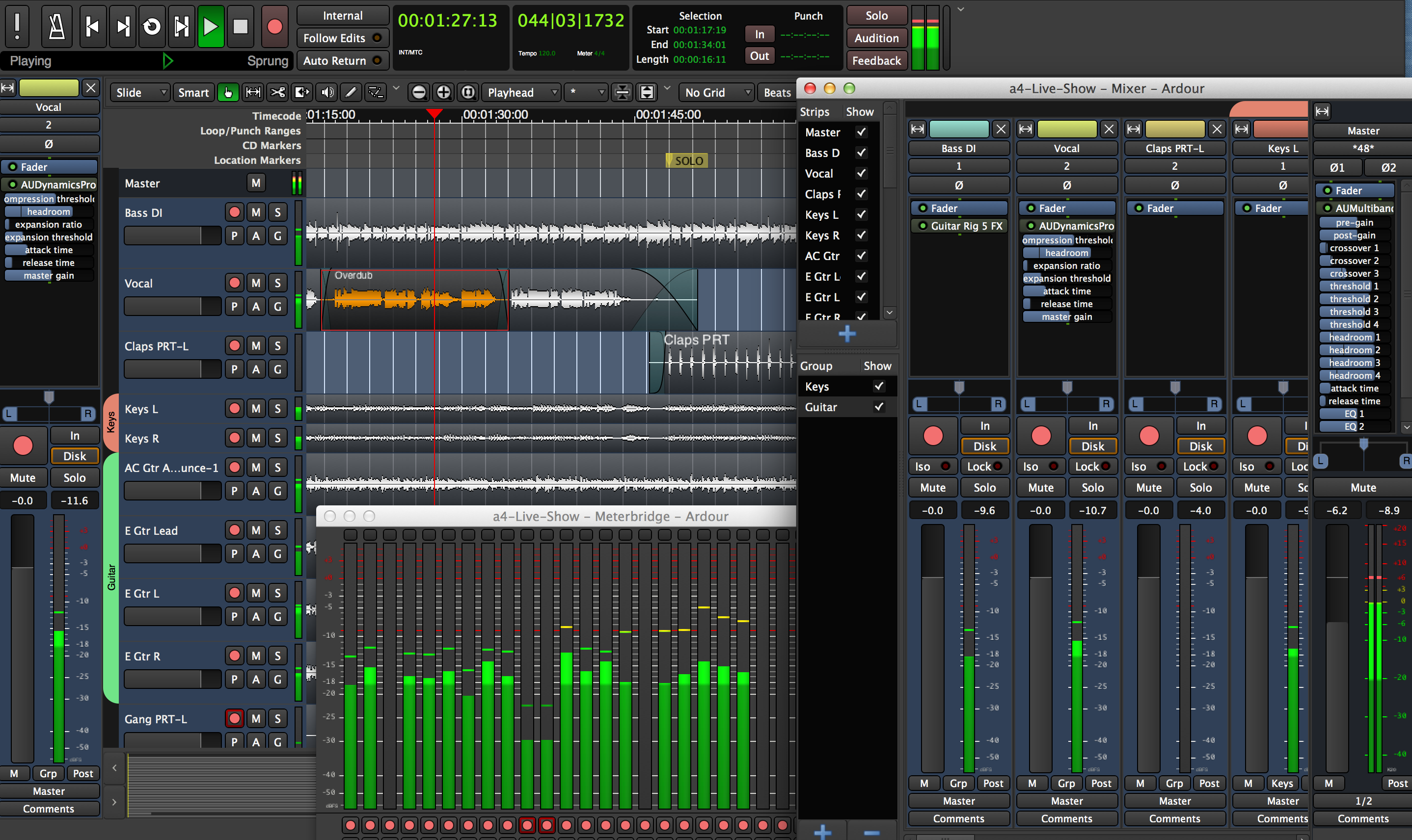
I'm not too surprised by those sorts of comments as it isn't easy to know why any of us have a particular opinion (in the sense of attributing it to a series of discrete positive and negative items). I would expect people to regularly have a feeling of "that was more difficult than I expected" and to negatively think about the tool in question. Additionally when it comes to GUIs there's a lot of little things which come together for polish that a user is unlikely to note directly, but it will still give them a negative impression none the less. In the case of ardour, look closely at a screenshot of the UI (e.g.
https://ardour.org/images/retina_no_plugs2.png ). From here we can see:
- The dB scale is a smaller hard to read font
- The Iso/Lock buttons are left justified when everything else appears to be centered
- The Group/Strip list headers are missing some padding or shouldn't be left justified
- Plugin parameter text is frequently too long
- The green bars linking plugins appears to be 1px too high
- in strips "E Gtr L" has another letter clipping through
- different font antialiasing looks like it exists within the waveform timeline than the labels to the left
- the buttons in the top left of the main window appear to be vectorized where as the lower icon buttons appear to use low res images
- the buttons in the top left of the main window look like they were designed to be square rather than rectangular
- The text for Tempo/Meter are way too small
- There are multiple dropdown indicators in the row that has "Slide, Smart, Playhead"
- It looks like there may be different a radius for different button types
- In the plugin parameter sliders the "off" color is hard to distinguish from the background
- The scrollbar appears to be a toolkit default and looks too chunky compared to the rest of the elements
Note that the above comments are based upon just looking at a screenshot and ignoring any of the issues about usability or any issues that arise with various interactions. I think ardour is an impressive piece of software, but from a user who isn't interested in design these small issues pile up until it's just a general sense of "just make it better" and it's hard to express why that opinion is there.


